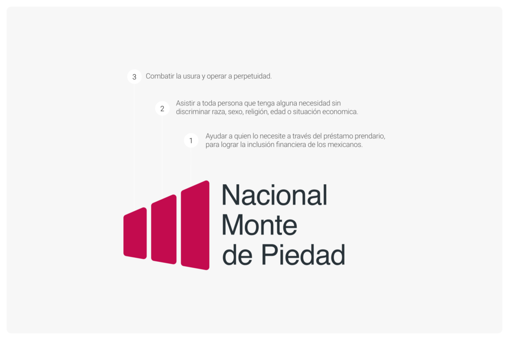
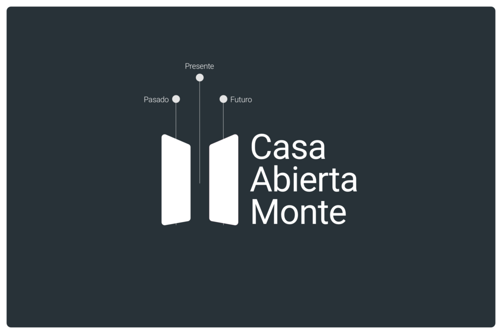
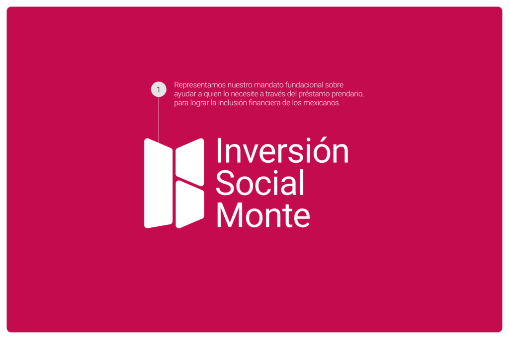
Nacional Monte de Piedad
THE PROJECT
In preparation for the 250th anniversary of Nacional Monte de Piedad, celebrated in February 2025, the design team was tasked with proposing a rebranding that would honor the institution’s legacy while projecting a vision for the future. As part of this initiative, I not only redesigned the main logo for Nacional Monte de Piedad but also took the opportunity to create a cohesive brand identity for Casa Abierta Monte and Inversión Social Monte, ensuring a unified and recognizable visual language across all sub-brands.
THE OBJECTIVE

The goal was to create a modern and meaningful visual identity that celebrated the institution’s 250 years of history while embodying its foundational mandates:

  1. To assist those in need through pawn loans, fostering financial inclusion for all Mexicans.
  2. To serve anyone in need, regardless of race, gender, religion, age, or economic situation.
  3. To combat usury and operate perpetually.

This rebranding sought to create a consistent visual identity that would make the institution more easily recognizable among Mexicans while reflecting its ongoing transformation and commitment to future challenges.

CREATIVE PROCESS
1
Concept Development.
I was inspired by the three founding mandates of Nacional Monte de Piedad. These principles guided the creation of three distinct panels in the logo design, representing the institution’s focus on financial inclusion, non-discrimination, and perpetuity. The panels are angled towards the right, symbolizing a forward-thinking vision and the institution’s future operations.
2
Redesign of Sub-Brands.

To ensure coherence across all brands under Nacional Monte de Piedad:

  • Casa Abierta Monte: For this logo, I took the largest panel from the main Nacional Monte de Piedad logo and duplicated it, altering the perspective of one to simulate an open door. This design symbolizes the brand’s welcoming nature while representing the passage of time. The left panel represents the past, the empty space between them signifies the present, and the right panel stands for the future, conveying a sense of continuity and progress.
  • Inversión Social Monte: The panels were transformed into a butterfly silhouette, representing the brand’s role in social transformation and the weaving of a stronger social fabric.
3
Color Palette.
The color choices were carefully selected to convey professionalism and trust, using Carmín (#C30B4E), Dupont (#283238), and White (#FFFFFF) to maintain a balance between tradition and modernity.
THE SOLUTION

The final rebranding provided a cohesive visual identity that linked all three entities under Nacional Monte de Piedad:

  • Nacional Monte de Piedad: A logo that encapsulates the institution’s three core mandates with rounded edges, emphasizing its adaptability and transformation in facing future challenges.
  • Casa Abierta Monte: A design featuring two panels with altered perspectives to form an open door, representing the past, present, and future, and reinforcing the brand’s message of openness and forward momentum.
  • Inversión Social Monte: The panels form a butterfly silhouette, reflecting the brand’s commitment to social impact and transformation.
FINAL IMPACT
This comprehensive rebranding effort resulted in a unified and forward-looking identity that honors the rich history of Nacional Monte de Piedad while positioning it for the future. The new logos convey a sense of continuity, transformation, and dedication to social well-being, making the brand more recognizable and relevant to the Mexican public.