Overview
Corpóreo is a wellness brand I developed from scratch, created for a client whose personal journey through physical recovery inspired a space dedicated to body care and long-term well-being. The brand offers massage services that combine personalized attention with a professional, calming environment. I led the full identity creation — from naming and brand strategy to typography, color, and iconography — to build a visual system that balances comfort, sensuality, and trust.
The Challenge
Designing a wellness brand from the ground up meant translating deeply personal values — care, safety, expertise — into a visual language that felt both intimate and professional. The challenge was to craft an identity that could stand out in a saturated market while communicating calm, clarity, and human connection.


Design Approach
1
Defining the Brand Name.
I created the name Corpóreo to reflect the connection between physical presence and emotional well-being. The name needed to be evocative, memorable, and aligned with the brand’s values.
2
Researching Emotional Cues.
I explored the wellness and recovery landscape to understand how brands in the space express professionalism and warmth. This helped define the emotional and visual tone we needed to hit.
3
Exploring Visual Directions.
Using moodboards and sketches, I tested directions that merged soft, soothing aesthetics with modern design sensibilities — aiming for a balance between elegance and approachability.
4
Designing the Identity System.
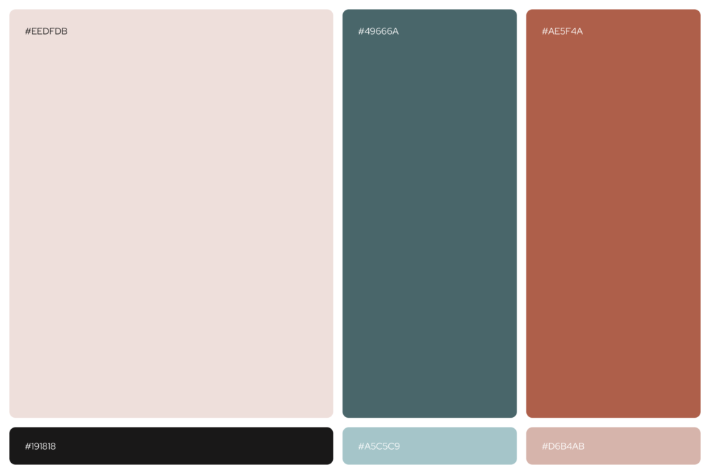
I created a clean, modern logo with generous spacing, selected Red Hat Display for its accessible yet elegant style, and built a calming color palette using Eerie Black, Redwood, and Light Blue to convey trust and tranquility.
5
Creating Visual Assets.
I designed a minimalist icon system featuring massage gestures and self-care moments, reinforcing clarity, professionalism, and human touch across all brand materials.

Key Design Decisions
Evocative brand name that captures the essence of physical and emotional connection.
Minimalist logo, crafted for clarity, softness, and modern appeal.
Elegant, soothing color palette aligned with the brand’s tone.
Typography that merges refinement with accessibility.
Line-based iconography illustrating care, technique, and trust.
FINAL IMPACT
The resulting identity captures a refined and emotionally resonant experience, positioning Corpóreo as a trusted wellness brand focused on body recovery, personalized care, and long-term well-being. The design system expresses calm and clarity while leaving room for growth and storytelling — visually reflecting the depth behind the brand’s origin and purpose.