OVERVIEW
As part of a creative exploration exercise, I developed a conceptual rebranding for Nacional Monte de Piedad in celebration of its 250th anniversary. The goal was to imagine a forward-looking visual identity that could honor the institution’s historic legacy while expressing its ongoing transformation, social mission, and future aspirations. The proposal included a new brand system for Monte and its two sub-brands: Casa Abierta Monte and Inversión Social Monte.
The Challenge
How do you reinterpret 250 years of social purpose into a modern and cohesive visual identity? The challenge lay in capturing Monte’s founding principles — financial inclusion, non-discrimination, and perpetuity — in a way that felt timeless yet contemporary. The system also needed to accommodate two sub-brands with distinct focuses, all under a unified visual language.


Design Approach
1
Translating Principles into Visual Form.
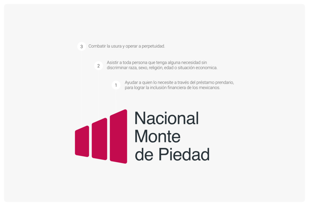
I based the system on three core mandates, which I represented as rounded panels angled forward — suggesting continuity, evolution, and inclusivity. These shapes became the foundation for the entire visual architecture.
2
Designing Sub-Brand Interpretations.
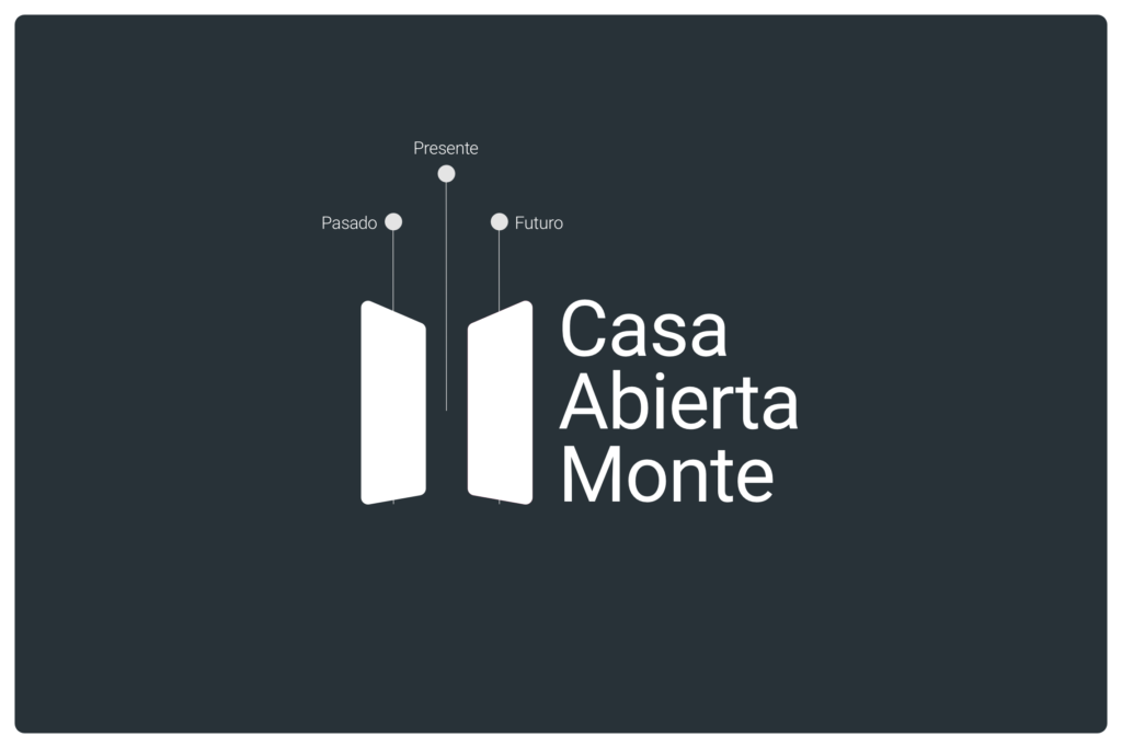
Casa Abierta Monte: Two panels positioned as an open door symbolizing past, present, and future — reinforcing openness and forward motion.
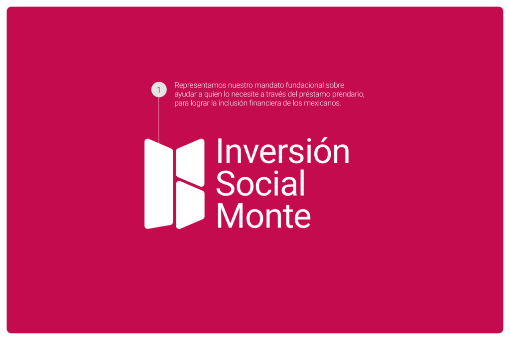
Inversión Social Monte: Panels arranged into a butterfly form, representing social impact, growth, and transformation.
3
Exploring Color and Meaning.
To balance tradition and modernity, I defined a color palette using Carmin (#C30B4E) for transformation, Dupont (#283328) for institutional trust, and White (#FFFFFF) for clarity and neutrality.


Key Design Decisions
Modular panel system, encoding core values into a flexible visual structure.
Metaphoric logo forms, expressing openness (door) and social evolution (butterfly).
Strategic color palette, reinforcing emotional tone and brand depth.
Scalable identity, imagined to work across programs, platforms, and sub-brands.
FINAL IMPACT
While the project was not implemented, the rebranding proposal demonstrates how design can be used to honor institutional legacy while projecting relevance, clarity, and transformation. It stands as an exploration of how visual identity systems can embody mission, values, and cultural resonance — especially for socially driven institutions.